Flyers Update
Like with our business cards, our first layout of our flyer designs were good but it wasn’t great! Sure the designs looked awesome but the presentation needed an overhaul. We were so excited to get these designs out at the time… ohhh I remember like it was yesterday. Furiously excited, passion in the air and in a frantic rush. No one on our team spoke of or considered the presentation.
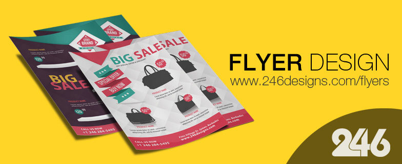
The result was proper designs just slapped onto a website with a gloomy look! But it’s 2016! A new year. A proper year! We’ve rectified our past transgressions and turned our gloomy flyer page into a proper grid layout so you can view the designs in all their splendor!
On reflection sometimes rushing is a bad thing. But we could’ve never fixed the layout had not for some of our customers who were kind enough to give constructive criticism. To say thank you we’ve added a few new designs to offer an even wider range! Take a look at our redesigned flyer page at www.246designs.com/flyers


